The Ultimate Guide to UX Typography – Principles and Elements Unveiled
Typography is more than just choosing fonts; it’s about creating an immersive user experience that enhances readability, engagement, and brand identity. In this comprehensive guide, we’ll explore the principles and elements of typography essential for crafting exceptional user interfaces (UI) and user experiences (UX).
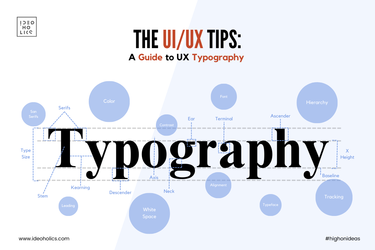
1. Legibility and Readability:
Legibility refers to how easily individual characters can be distinguished, while readability pertains to how effortlessly text can be read. Choose fonts that are clear, balanced, and optimized for various screen sizes. Ensure adequate contrast between text and background to improve legibility, and maintain ample line spacing and paragraph spacing for enhanced readability.
2. Hierarchy:
Hierarchy guides users through content by prioritizing information based on its importance. Utilize variations in font size, weight, color, and style to establish a clear hierarchy. Important headings and titles should stand out prominently, while secondary information can be presented in a subdued manner. Consistent hierarchy enhances navigation and comprehension.
3. Alignment and Consistency:
Alignment creates a sense of order and coherence within a layout. Choose between left, right, center, or justified alignment based on the context and aesthetic preferences. Maintain consistency in typography across all pages and elements of the interface to reinforce brand identity and facilitate user understanding.
4. Contrast and Emphasis:
Contrast adds visual interest and draws attention to key elements. Experiment with different font styles, weights, and colors to create contrast between headings, body text, and interactive elements. Use emphasis sparingly to highlight important information or calls to action, but avoid overwhelming users with excessive decoration.
5. White Space:
White space, also known as negative space, provides breathing room for text and other elements, improving clarity and comprehension. Incorporate ample white space between lines, paragraphs, and sections to prevent overcrowding and enhance visual appeal. Well-balanced white space contributes to a more harmonious and immersive user experience.
6. Responsive Typography:
In the era of multiple devices and screen sizes, responsive typography ensures optimal legibility and readability across various platforms. Use fluid typography techniques, such as viewport units and responsive breakpoints, to adapt font sizes and layouts dynamically. Test typography on different devices to ensure a seamless user experience regardless of screen size.
7. Accessibility:
Accessible typography ensures that content is perceivable, operable, and understandable for all users, including those with visual impairments. Choose fonts with distinct letter-forms and sufficient contrast ratios between text and background. Provide options for adjustable font sizes and styles to accommodate diverse user needs.
Incorporating these principles and elements of typography into your UI/UX design can elevate the overall user experience and leave a lasting impression on your audience. By prioritizing legibility, hierarchy, consistency, and accessibility, you can create interfaces that are not only visually appealing but also intuitive and user-friendly. Whether you’re designing a website, mobile app, or digital product, typography remains a powerful tool for communication and engagement.