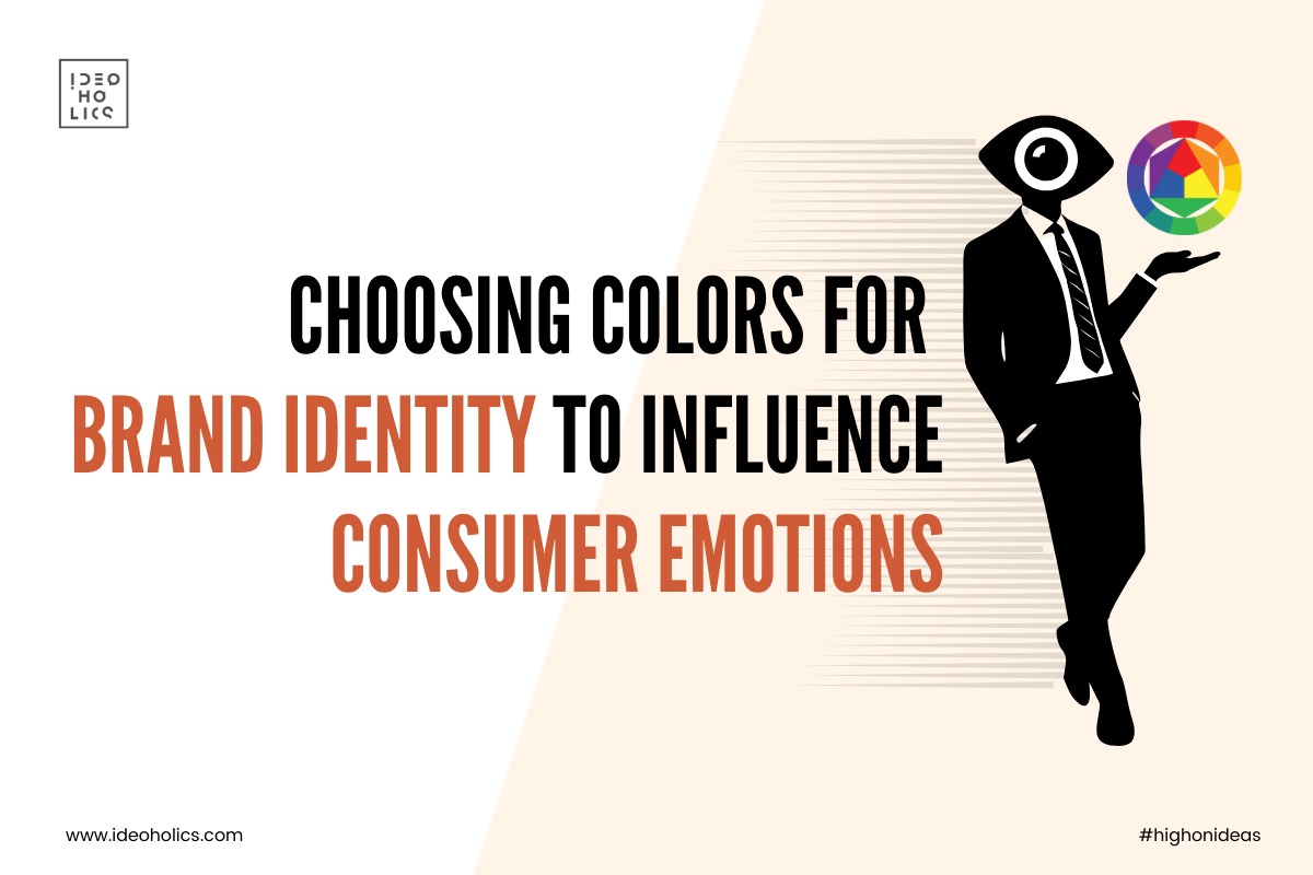
The Psychology of Colors in Branding: Unraveling the Impact of Hue
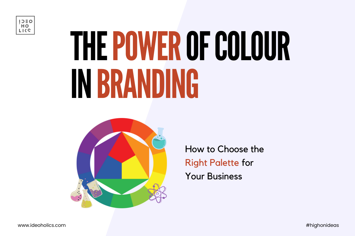
In the kaleidoscope of branding, colors are more than just visual elements—they are powerful tools that evoke emotions, convey messages, and shape perceptions. From the vibrant energy of red to the serene calmness of blue, each color carries its own personality and psychological implications. In this comprehensive exploration, we delve into the psychology of colors, dissecting the positive and negative vibes of each hue, and examining real-life brand examples that masterfully leverage color to leave a lasting impression on consumers.
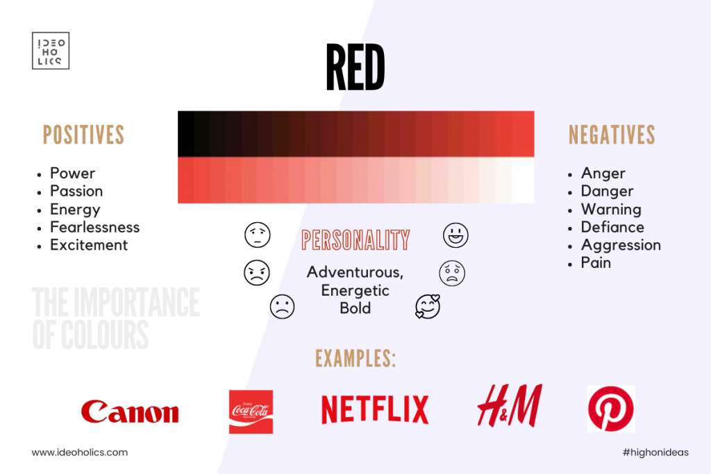
Red: The Color of Passion and Power
Positive Vibes: Red exudes passion, energy, and excitement. It grabs attention and stimulates the senses, making it ideal for brands that want to evoke feelings of urgency and intensity. Coca-Cola, known for its bold red branding, harnesses the power of this color to create a sense of joy and celebration.
Negative Vibes: On the flip side, red can also evoke feelings of danger, aggression, and impulsiveness if used excessively. Brands must strike a balance to avoid overwhelming their audience with too much intensity.
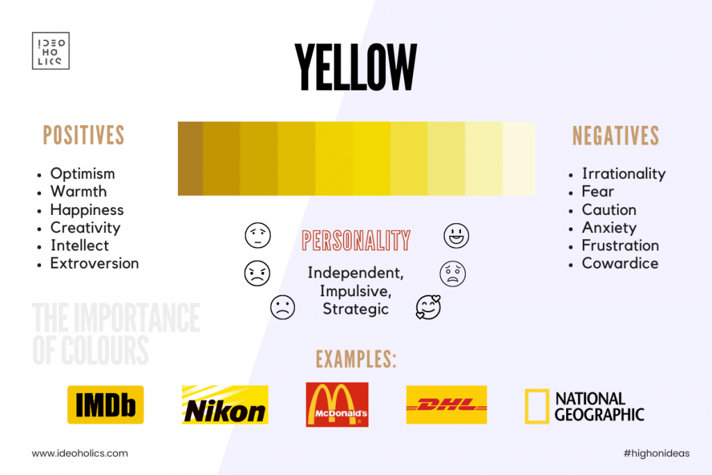
Yellow: The Color of Sunshine and Optimism
Positive Vibes: Yellow radiates warmth, happiness, and optimism. It captures attention and inspires positivity, making it a popular choice for brands that want to convey a sense of cheerfulness and friendliness. McDonald’s, with its iconic golden arches, uses yellow to create a sense of fun and energy around its brand.
Negative Vibes: However, yellow can also be perceived as overly stimulating or cautionary if used inappropriately. Brands must be mindful of striking the right tone to avoid coming across as too loud or aggressive.
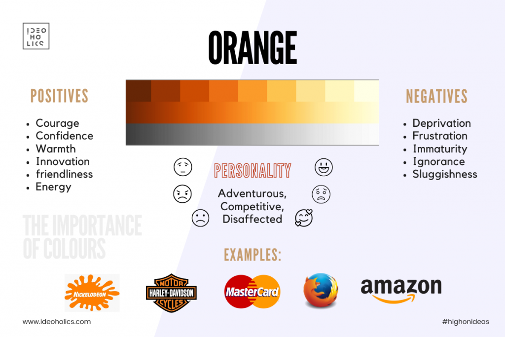
Orange: The Color of Creativity and Enthusiasm
Positive Vibes: Orange combines the energy of red with the optimism of yellow, creating a vibrant hue that exudes creativity and enthusiasm. It stimulates the senses and evokes feelings of excitement and innovation. Home Depot, with its vibrant orange branding, conveys a sense of vitality and creativity in the home improvement industry.
Negative Vibes: Like red and yellow, orange can be overwhelming if used excessively. Brands must exercise restraint to ensure that their messaging remains clear and focused.
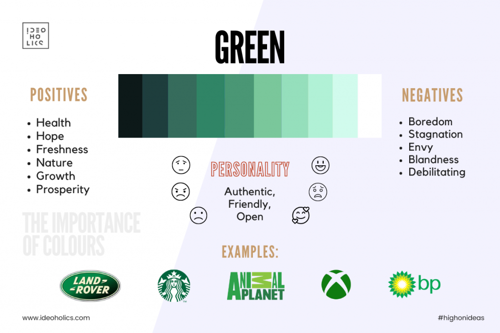
Green: The Color of Growth and Harmony
Positive Vibes: Green symbolizes growth, harmony, and nature. It evokes feelings of freshness, vitality, and sustainability, making it an ideal choice for brands in the health, wellness, and environmental sectors. Starbucks, with its iconic green logo, conveys a sense of balance and connection with nature, inviting customers to relax and enjoy their coffee experience.
Negative Vibes: While green is generally associated with positive attributes, it can sometimes be perceived as bland or uninspiring if not used thoughtfully. Brands must leverage green in a way that resonates with their audience and aligns with their brand values.
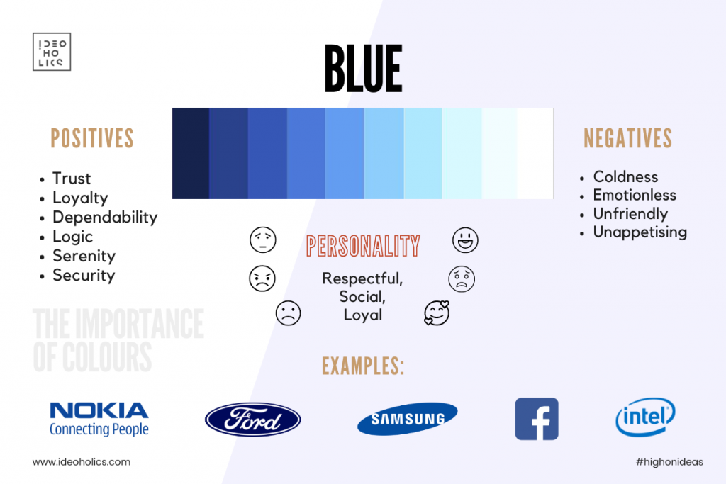
Blue: The Color of Trust and Stability
Positive Vibes: Blue exudes trust, reliability, and professionalism. It instills a sense of calm and confidence, making it a popular choice for brands in finance, technology, and healthcare. Facebook, with its calming blue interface, creates a sense of trust and security in the social media landscape.
Negative Vibes: However, blue can also come across as cold or aloof if used excessively. Brands must infuse warmth and personality into their messaging to avoid appearing too sterile or impersonal.
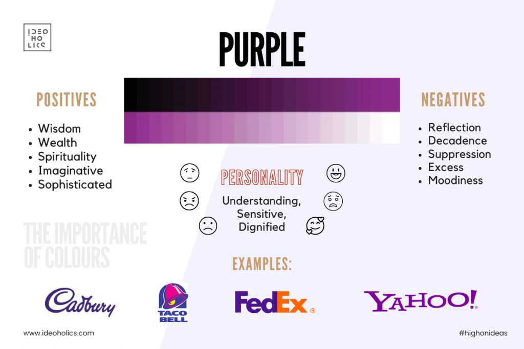
Purple: The Color of Luxury and Creativity
Positive Vibes: Purple symbolizes luxury, creativity, and spirituality. It exudes sophistication and elegance, making it a popular choice for upscale brands that want to convey a sense of exclusivity and prestige. Cadbury, with its regal purple packaging, creates a sense of indulgence and luxury in the confectionery industry.
Negative Vibes: Purple can sometimes be perceived as too extravagant or impractical if not used judiciously. Brands must strike a balance to ensure that their messaging remains relatable and accessible to their target audience.
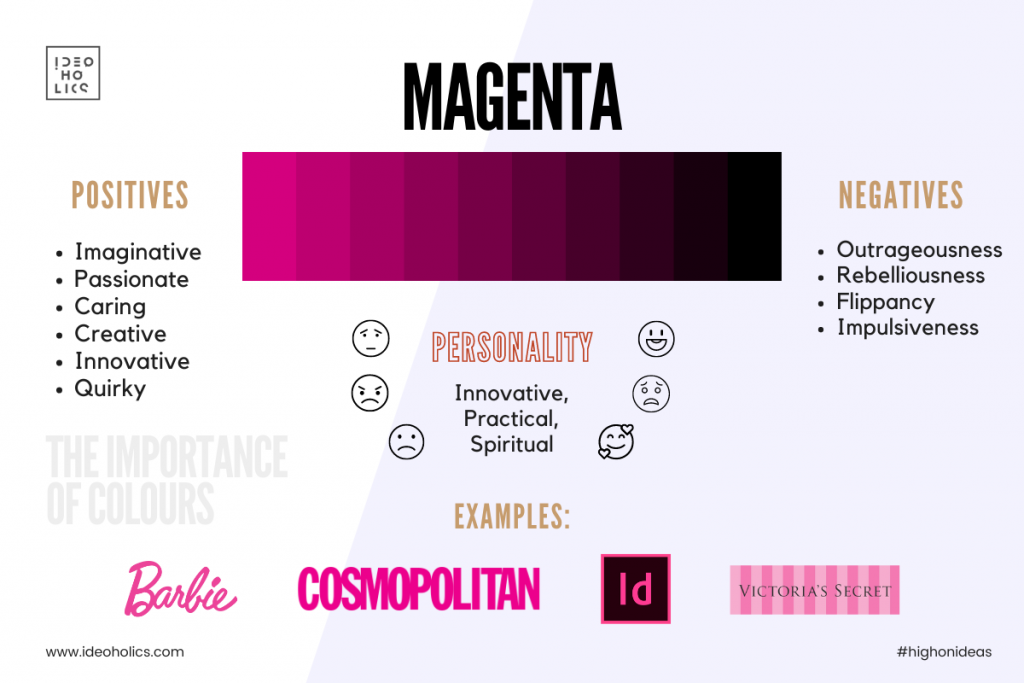
Magenta: The Color of Passion and Playfulness
Positive Vibes: Magenta combines the energy of red with the vibrancy of purple, creating a hue that exudes passion and playfulness. It stimulates the senses and evokes feelings of excitement and creativity. T-Mobile, with its bold magenta branding, stands out in the telecommunications industry, conveying a sense of energy and innovation.
Negative Vibes: Like other bold colors, magenta can be overwhelming if used excessively. Brands must exercise restraint to ensure that their messaging remains clear and focused.
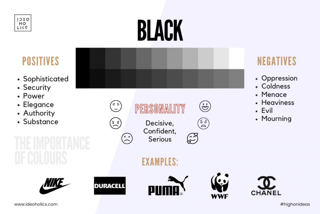
Black: The Color of Power and Elegance
Positive Vibes: Black exudes power, elegance, and sophistication. It symbolizes strength and authority, making it a popular choice for luxury brands that want to convey a sense of exclusivity and refinement. Chanel, with its iconic black-and-white branding, epitomizes timeless elegance and sophistication in the fashion industry.
Negative Vibes: However, black can also come across as too serious or intimidating if not used thoughtfully. Brands must infuse warmth and personality into their messaging to avoid appearing too austere or unapproachable.
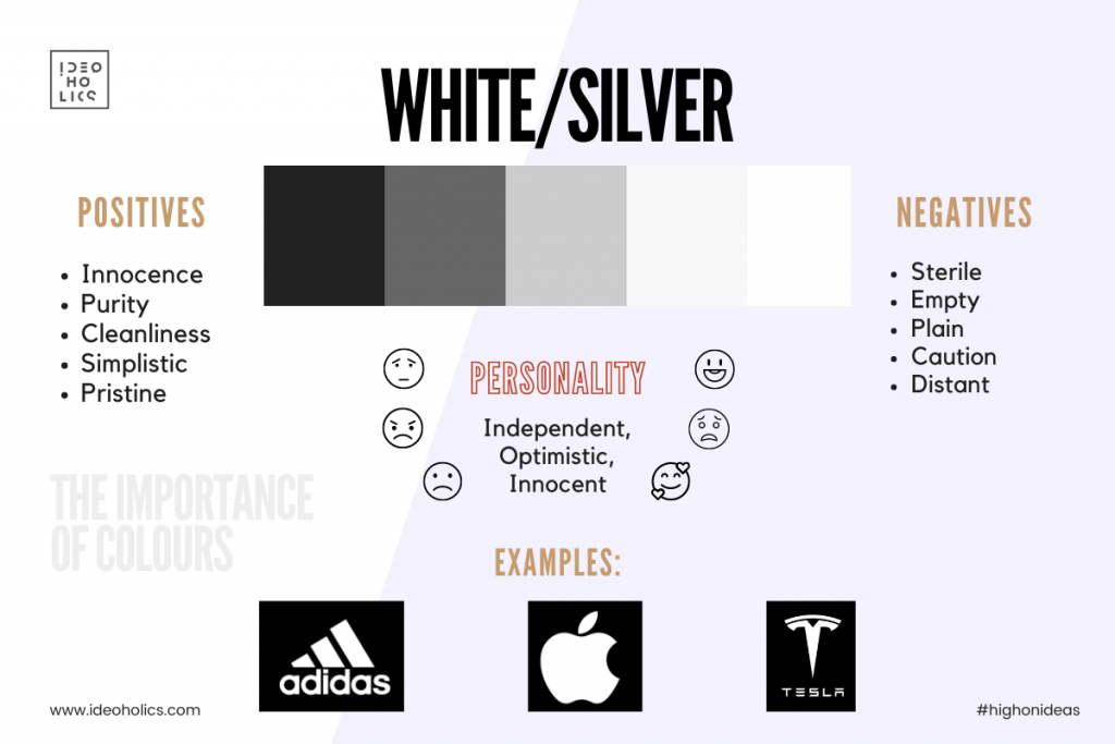
White: The Color of Purity and Simplicity
Positive Vibes: White symbolizes purity, simplicity, and cleanliness. It evokes a sense of freshness and clarity, making it a popular choice for minimalist brands that want to convey a modern and sleek aesthetic. Apple, with its minimalist white packaging and sleek black logo, creates a sense of sophistication and innovation in the technology industry.
Negative Vibes: While white is generally associated with positive attributes, it can sometimes be perceived as bland or uninspiring if not used thoughtfully. Brands must leverage white in a way that resonates with their audience and aligns with their brand values.
Conclusion:
In the colorful world of branding, every hue tells a story. By understanding the psychology of colors and their impact on human emotions, brands can strategically leverage color to create compelling brand identities and forge meaningful connections with their audience. Whether evoking passion with vibrant reds, instilling trust with calming blues, or radiating luxury with regal purples, the strategic use of color in branding has the power to elevate brands and leave a lasting impression on consumers. So, the next time you’re designing a brand identity or marketing campaign, remember to choose your colors wisely—they just might be the key to unlocking your brand’s full potential.